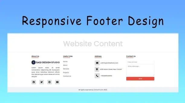
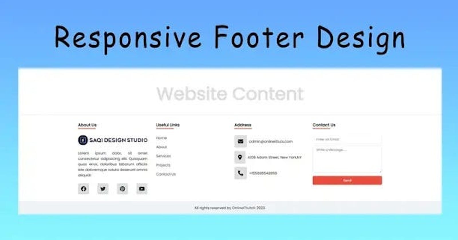
Want to learn how to make a responsive footer design using HTML and CSS here tutorial for you. I’m going to share with you how to use HTML and CSS3 to create an attractive, professional, and fully responsive footer.
Many users are facing problems managing the footer, so, I’m going to share with you step-by-step usage of HTML and CSS to design the footer without any content on the website.

Inside the footer, we are going to display more of the 4 sections on each section we going to add different content. Once you design it. Then we going to use a media query to make it as responsive.
A well-designed and responsive footer is an important component of any modern website. It not only provides valuable information but also enhances the overall user experience. In this article, we will explore the techniques and best practices for creating a responsive footer using HTML and CSS.
Responsive Footer Design Using HTML and CSS
A responsive footer plays a crucial role in web design. It serves as a consistent anchor at the bottom of every page, providing essential information and navigation options.
A well-designed footer enhances user experience, allowing visitors to access important links easily, contact information, copyright notices, and more.
Setting up the HTML Structure
To begin creating a responsive footer, it is essential to define the appropriate HTML structure. This involves using semantic HTML tags such as <footer>, <nav>, <ul>, and <li>. These tags help organize and structure the footer’s content, making it more accessible to both users and search engines.
<div class="container">
<h2>Website Content</h2>
</div>
<footer>
<div class="container">
<div class="footer_content">
<div class="first_section">
<h3 class="footer_headings">About Us</h3>
<img src="images/logo-1.png" alt="" />
<p>
Lorem ipsum dolor sit amet consectetur adipisicing elit. A
adipisci minus ratione nulla cum ut repellendus omnis, odit
ducimus nisi?
</p>
<div class="social_icons">
<i class="fa-brands fa-facebook"></i>
<i class="fa-brands fa-twitter"></i>
<i class="fa-brands fa-pinterest"></i>
<i class="fa-brands fa-youtube"></i>
</div>
</div>
<div class="second_section">
<h3 class="footer_headings">Useful links</h3>
<ul>
<li><a href="#">Home</a></li>
<li><a href="#">About</a></li>
<li><a href="#">Services</a></li>
<li><a href="#">Projects</a></li>
<li><a href="#">Contact Us</a></li>
</ul>
</div>
<div class="third_section">
<h3 class="footer_headings">Address</h3>
<ul>
<li>
<i class="fa fa-envelope"></i>
<span>admin@onlineittuts.com</span>
</li>
<li>
<i class="fa-solid fa-location-dot"></i>
<span>A108 Adam Street, New York, NY </span>
</li>
<li>
<i class="fa-solid fa-phone"></i>
<span>+15589 55488 55</span>
</li>
</ul>
</div>
<div class="fourth_section">
<h3 class="footer_headings">Contact Us</h3>
<form action="#">
<div class="form_control">
<input type="text" placeholder="Enter an Email" />
</div>
<div class="form_control">
<textarea
name=""
id=""
cols="10"
rows="5"
placeholder="Write Message....."
></textarea>
</div>
<button type="button">Send</button>
</form>
</div>
</div>
</div>
<div class="footer_txt">
<p>
All rights reservered by
<a href="https://www.onlineittuts.com">OnlineITtuts</a> © 2023.
</p>
</div>
</footer>
Basic Styling of the Footer
CSS plays a significant role in the visual presentation of the footer. Basic styling includes setting the background color or image, adjusting padding and margins for proper spacing, and choosing suitable fonts and color schemes for text elements. Consistency in styling across the website ensures a cohesive design.
@import url("https://fonts.googleapis.com/css2?family=Poppins&display=swap");

* {
  box-sizing: border-box;
  margin: 0;
  padding: 0;
  font-family: "poppins", sans-serif;
}

body {
  display: flex;
  align-items: center;
  justify-content: center;
  min-height: 100vh;
}

.container {
  max-width: 1440px;
  width: 100%;
  margin: 0 auto;
  padding: 0 2rem;
}

.container h2 {
  font-size: 5rem;
  color: #ddd;
  text-align: center;
  padding-bottom: 10rem;
}

footer {
  width: 100%;
  position: fixed;
  bottom: 0;
  background: #fff;
  box-shadow: -5px -0px 2px rgba(0, 0, 0, 0.5);
}

footer a {
  text-decoration: none;
  color: #1c2833;
}

.footer_content {
  display: grid;
  grid-template-columns: repeat(4, 1fr);
  padding: 2rem 0;
  grid-gap: 2.5rem;
}

.footer_headings {
  color: #000;
  padding-bottom: 2rem;
  position: relative;
}

.footer_headings::after {
  content: "";
  height: 3px;
  background: #e74c3c;
  width: 25%;
  position: absolute;
  top: 30px;
  left: 0px;
}

.first_section img {
  display: block;
  object-fit: cover;
  width: 100%;
}
.first_section p {
  padding: 1.5rem 0;
  text-align: justify;
}

.social_icons {
  display: flex;
  justify-content: space-between;
}

.social_icons i {
  font-size: 1.5rem;
  cursor: pointer;
  background: #ddd;
  width: 50px;
  height: 50px;
  display: flex;
  align-items: center;
  justify-content: center;
  border-radius: 5px;
  transform: translateY(0);
  transition: all 0.5s ease-in-out;
  color: #1c2833;
}

.social_icons i:hover {
  transform: translateY(-5px);
}

/* second sections */
.second_section ul {
  list-style: none;
}

.second_section ul li {
  margin: 1rem 0;
}

.second_section ul li:first-child {
  margin-top: 0;
}

/* third section */
.third_section ul {
  list-style: none;
}

.third_section ul li {
  margin: 1rem 0;
  display: flex;
}

.third_section ul li:first-child {
  margin-top: 0;
}

.third_section ul li i {
  margin-right: 10px;
  background: #ddd;
  border-radius: 5px;
  font-size: 1.5rem;
  padding: 1rem;
}

.third_section span {
  display: flex;
  align-items: center;
  justify-content: center;
}

/* fourth section */
.form_control input,
textarea {
  outline: none;
  border: none;
  border: 1px solid #ddd;
  padding: 0.5rem 1rem;
  margin-bottom: 0.5rem;
  width: 100%;
  border-radius: 5px;
  font-size: 0.9rem;
}

.fourth_section button {
  display: block;
  width: 100%;
  outline: none;
  background: #e74c3c;
  border: none;
  color: #fff;
  padding: 0.6rem 0;
  cursor: pointer;
  border-radius: 5px;
  font-size: 0.9rem;
}

.footer_txt {
  background: #f0f3f4;
  padding: 1.1rem 0;
  text-align: center;
  box-shadow: -5px -0px 2px rgba(0, 0, 0, 0.5);
}
Designing a Responsive Layout
To make the footer responsive, media queries are utilized. Media queries allow the footer to adapt to different screen sizes and orientations. Implementing a mobile-first approach ensures compatibility with smaller screens, and the layout adjusts gracefully as the screen size increases.
@media (max-width: 768px) {
  body {
    min-height: 50vh;
  }

  .footer_content {
    grid-template-columns: repeat(2, 1fr);
    grid-gap: 4rem;
    padding: 3rem 0;
  }

  .social_icons i {
    font-size: 1.3rem;
    width: 45px;
    height: 45px;
  }

  footer {
    position: absolute;
    top: 50%;
  }

  .container h2 {
    font-size: 4rem;
    padding-bottom: 5rem;
  }
}

@media (max-width: 568px) {
  .footer_content {
    grid-template-columns: repeat(1, 1fr);
    grid-gap: 3rem;
    padding: 2.5rem 0;
  }

  .container h2 {
    font-size: 3rem;
    padding-bottom: 4rem;
  }

  .social_icons i {
    font-size: 1rem;
    width: 35px;
    height: 35px;
  }

  footer {
    position: absolute;
    top: 30%;
  }
}
Creating Navigation Links and Social Media Icons
A responsive footer often includes navigation links and social media icons. Navigation links provide easy access to important pages or sections of the website, while social media icons allow visitors to connect with the website on various platforms. Styling these elements improves visibility and usability.
You May Also Like:
Copyright, Legal Information, and Contact Details
A well-crafted footer includes copyright notices, legal disclaimers, and contact information. These details are typically aligned and styled appropriately to provide a professional and organized appearance. Including relevant contact information, such as email or phone number, allows visitors to easily get in touch.
Enhancing the Footer with Additional Features
To further enhance the footer’s functionality, additional features can be incorporated. These may include a back-to-top button for smooth navigation, a newsletter subscription form for visitors to subscribe to updates, dynamic content or relevant widgets, and ensuring compatibility across different browsers and devices.
Testing and Optimization
Once the footer design is complete, it is crucial to thoroughly test its responsiveness across multiple devices and screen sizes. This ensures that the footer maintains its functionality and appearance on various platforms. Debugging any layout or alignment issues and optimizing the footer for performance and loading speed are essential for an optimal user experience.
Conclusion:
How to make a responsive footer design using HTML and CSS, A responsive footer is an integral part of a well-designed website. By employing the techniques and best practices outlined in this article, you can create a visually appealing and functional footer using HTML and CSS. A responsive footer enhances the user experience and contributes to the website’s overall professionalism and usability.
