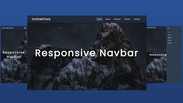
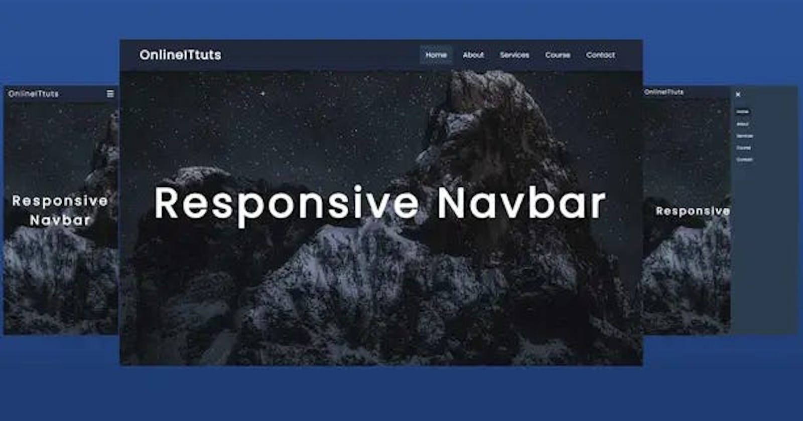
Struggling to create a responsive navbar for your website? Don’t stress! You can easily create one with HTML and CSS. In this tutorial, we’ll show you exactly how to make responsive navbar in html css for every device. Engage your audience now and empower them with the knowledge they need to create their own timeless navigation bar.
Creating a responsive navbar in HTML and CSS can be a surprisingly complex solution, especially for newer web developers. This tutorial is designed to help you understand the basics of creating this type of navigation bar and how to optimize it for desktop and mobile devices.

By the end of this tutorial, you will have a fully functioning and interactive navigation bar on your website that automatically adjusts its size depending on the device viewing it. The process involves working with both HTML, CSS, and some JavaScript (jQuery) code to make the navigation bar work properly across all devices.
Understanding Responsive Design
Responsive design is an approach used in web development that ensures an optimal viewing experience across a wide range of devices. The idea is to create a website that can dynamically adjust based on the device being used to access it. This means that regardless of the device or screen size, the website will still be engaging and easy to use.
There are many things we can do in order to make a website responsive. In this tutorial, we will take a look at one technique for making our navigation bar responsive using HTML and CSS. By making our navigation bar “responsive,” we are ensuring that it looks good no matter what device it is being viewed from, as well as providing modern functions like toggling between screens with the hamburger button.
So what exactly does it mean when we talk about making something “responsive”? Responsive design means essentially you’re designing for all types of devices, which includes desktop computers, mobile phones, tablets, and even watches! A responsive navigation bar will adjust itself based on the size of the browser or device so that all users have a pleasant viewing experience regardless of what type of technology they are using.
How to Make a Responsive Navbar in HTML CSS
Modern website navigation requires a different approach than it did just a few years back. With the increase in mobile device usage and different resolutions and aspect ratios, responsive web navigation is a must. Navbars should be able to organize many sections into one area, as well as make it easier for users to find their way around. This guide will provide an introduction to creating a basic responsive navbar using HTML and CSS.
I’ve made the complete video tutorial, inside the tutorial you will learn step by step how to make responsive navbar in html css and also little bit of JavaScript. Also I’ve shared with each code that are help you to understand everything.
<!DOCTYPE html>
<html lang="en">
  <head>
    <meta charset="UTF-8" />
    <meta http-equiv="X-UA-Compatible" content="IE=edge" />
    <meta name="viewport" content="width=device-width, initial-scale=1.0" />
    <link
      rel="stylesheet"
      href="https://cdnjs.cloudflare.com/ajax/libs/font-awesome/6.2.0/css/all.min.css"
    />
    <link rel="stylesheet" href="style.css" />
    <title>Responsive Nevigation Menus in HTML CSS and JavaScript</title>
  </head>
  <body>
    <header>
      <a href="#" class="logo">OnlineITtuts</a>
      <nav class="navbar">
        <div class="btn">
          <i class="fas fa-times close-btn"></i>
        </div>
        <a href="#" class="active">Home</a>
        <a href="#">About</a>
        <a href="#">Services</a>
        <a href="#">Course</a>
        <a href="#">Contact</a>
      </nav>
      <div class="btn">
        <i class="fas fa-bars menu-btn"></i>
      </div>
    </header>
    <section>
      <h2>Responsive Navbar</h2>
    </section>

    <script src="script.js">

    </script>
  </body>
</html>
It’s index.html file inside have a basic structure of HTML and have links text etc. Once you use this code, you need to use CSS to design it. So, Let’s look at that the CSS Code.
@import url("https://fonts.googleapis.com/css2?family=Poppins&family=Roboto&display=swap");
* {
  margin: 0;
  padding: 0;
  box-sizing: border-box;
  text-decoration: none;
  font-family: "Poppins", sans-serif;
}

html {
  font-size: 62.5%;
}

body {
  background: url("img.jpg") no-repeat center center/cover;
  height: 100vh;
  overflow: hidden;
}

header {
  position: fixed;
  width: 100%;
  display: flex;
  justify-content: space-between;
  align-items: center;
  padding: 15px 50px;
  background: #21293a;
  color: #fff;
  box-shadow: 0 0.5rem 1.5rem rgba(0, 0, 0, 0.5);
}

header .logo {
  font-size: 30px;
  font-weight: 700;
  text-decoration: none;
  letter-spacing: 2px;
  color: #fff;
}

header .navbar {
  position: relative;
  display: flex;
  justify-content: center;
  align-items: center;
}

header .navbar a {
  font-size: 1.7rem;
  font-weight: 500;
  text-decoration: none;
  margin: 0 0.5rem;
  padding: 1rem 1.5rem;
  border-radius: 05px;
  color: #fff;
  letter-spacing: 1px;
}

header .navbar a:hover,
.active {
  background: #2c3e50;
  transition: 0.6s;
}

header .btn {
  font-size: 25px;
  cursor: pointer;
  display: none;
}

section {
  display: flex;
  justify-content: center;
  align-items: center;
  height: 100vh;
}

section h2 {
  color: #fff;
  font-size: 10rem;
  letter-spacing: 0.9rem;
  text-align: center;
}

@media (max-width: 991px) {
  html {
    font-size: 55%;
  }
  header {
    padding: 1rem 2rem;
  }
}

@media (max-width: 768px) {
  header .btn {
    display: block;
  }

  header .navbar {
    position: fixed;
    flex-direction: column;
    min-width: 300px;
    height: 100vh;
    background: #2c3e50;
    top: 0;
    right: -100%;
    transition: all 0.9s;
    align-items: flex-start;
    justify-content: flex-start;
    padding-top: 10rem;
  }

  header .navbar.active2 {
    right: 0;
    transition: 0.9s;
  }

  header .navbar .close-btn {
    position: absolute;
    top: 0;
    left: 0;
    margin: 25px;
  }

  header .navbar a {
    display: block;
    font-size: 1.9rem;
    margin: 15px;
    padding: 0.5rem 15px;
  }

  header .navbar a:hover {
    background: #21293a;
    color: #fff;
  }

  header .logo {
    font-size: 25px;
    font-weight: 500;
  }

  section h2 {
    color: #fff;
    font-size: 5rem;
    padding: 2rem;
    letter-spacing: 0.9rem;
    text-align: center;
  }
}
here is the CSS code that helps us to design the responsive navbar bar, but the last thing we need to use is JavaScript to display the hide navbar when the user will resize the screen. So, Let’s see the JavaScript code.
You May Also Like:
let menus = document.querySelector(".navbar");
let menus_btn = document.querySelector(".menu-btn");
let close_btn = document.querySelector(".close-btn");

menus_btn.addEventListener("click", function () {
  menus.classList.add("active2");
});

close_btn.addEventListener("click", function () {
  menus.classList.remove("active2");
});
To create the navigation bar for your website, you will need to start by adding the necessary elements. This can be done with either HTML or CSS. Depending on your preferred style of coding, you may want to consider using both methods.
In HTML, the first step is to create a div element with a “navbar” class assigned to it. Inside this div, add an unordered (ul) list of links and their associated drop-down menus (defined as “li”). These should be semantically correct and coded in a way that makes sense for the design of your website.
CSS can also be used to help create a responsive navigation bar on any size device. Setting up media queries can allow you to adjust the size and appearance of each navbar element based on the size of the device being used. Additionally, CSS3 transitions or transforms can also be used to add polish and enhance its functionality as needed.
These are just some simple steps that can be taken when creating a responsive navigation bar in HTML & CSS for modern websites or applications. In any case, it is recommended that you carefully consider the various elements required for creating this type of element before starting any coding process.
Customizing Your Responsive Navbar
When customizing a responsive navbar, there are a few key elements to consider. To create a basic and functional layout, it should include links in the navigation bar that link to different parts of the website. As users interact with the website, they will be able to quickly move from page to page with ease. Additionally, in order for the navigation bar to be accessible on all devices, it should have a collapsible menu and easily customizable style options—such as sizes and colors—in order for it to look and function correctly on any device type or screen size.
In HTML, we can customize a navigation bar by structuring it correctly in HTML by properly nesting headings and divs as well as using IDs/classes that indicate positions. We can also use CSS techniques such as flexbox or grid layouts (which aren’t supported by all browsers) so that our navbar fits within limits viewport of different devices.
This can include properties such as width media queries used to set each elements size according to viewport widths or heights along with other techniques like adding an icon bar that collapses the navigation when clicked on using JavaScript or jQuery functions from within a script tag.
We should also use relative lengths—such as percentages —for paddings, margins and font sizes for better accessibility for different devices instead of absolute units like px).
Finally, make sure we specify unique IDs or classes for each element so that our styles don’t conflict with any existing ones when customizing our responsively navbar!
Testing and Troubleshooting Your Navbar
Once your layout is complete, it’s time to test and troubleshoot any issues. Start by checking that your navbar is mobile-friendly; resize your browser window and make sure the menu items are correctly positioned, aligned and accessible from any viewport size. It may also be helpful to test with multiple screen sizes to check compatibility.
As you resize the window, you may find it difficult to actually select menu items on small screen devices; the user needs to be able to tap on buttons easily. You can add a hover effect for non-touch devices or create a custom interaction so that menus only appear when they’re needed.
In addition, make sure that all links are active and pointed at the correct page or anchor point within the page. You will also want to confirm that forms submit correctly, animations work as expected, and other features that you have included function correctly – such as search boxes, sliders, or galleries – before taking your design live.
How to Make Navbar Using HTML and CSS
here is a cool and fully responsive navbar, I’ve used a background image with an overlay background. I’m going to share with you the complete tutorial on it. You can watch my complete tutorial to learn everything step by step.
Conclusion
When it comes to creating a responsive navbar with HTML and CSS, there are several key elements to consider. The overall structure of the navbar should be organized, you should use a grid system for content placement and make sure that the font sizes and line heights scale with the viewport size.
Additionally, make sure that all of your media queries are written correctly so that content looks good on different screen sizes. Finally, design your icons and animations with both function and aesthetics in mind.
With these tips in mind, you should have no problem creating a responsive navigation bar for your website or web application!
