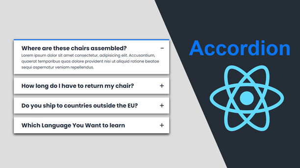
Hey guys, today we are going to learn How to Make an Accordion in React JS, I will teach you everything from scratch without using third-party libraries or built-in components. Many websites are using the Accordion to display the Questions and also answers.
Introduce the idea of accordions in net improvement and their usefulness in organizing content material effectively. Briefly point out that React JS supplies a handy option to implement accordions for net purposes.

Clarify what accordions are and the way they operate. Describe their attribute characteristic of hiding and revealing content material sections upon person interplay, normally by way of clicks.
How to Make An Accordion in React JS
Let’s see the tutorial that I made, before moving the codes, you should watch the video tutorial that will help you to understand everything step by step from scratch.
I Hope you’ve watched the video till to end and you’ve got many new ideas from it, let’s look at the source codes that I used inside the project.
You May Also Like:
Setting Up Your React JS Project
Information readers by way of establishing a primary React JS venture if they have not already. Point out creating a brand new venture utilizing create-react-app or any most popular techniques.
npm create vite@latest
Putting in Dependencies
Clarify the dependencies required for implementing accordions in React JS, corresponding to react and react-dom. Present directions on setting up these dependencies utilizing npm or yarn.
cd my-project

npm install
npm run dev
Creating the Accordion Element
Describe the method of making a reusable Accordion element in React JS. Break down the element’s construction and performance, together with state administration for monitoring open/shut states.
import faqs from "../data";
import { Accordion } from "./Accordion";

function App() {
  return (
    <div className="container">
      <Accordion data={faqs} />
    </div>
  );
}

export default App;
Once you make a App.jsx, then the next thing you need make another file namely Accordion.jsx, Let’s see the codes that are used on the Accordion file.
import React, { useState } from "react";
import { AccordionItem } from "./AccordionItem";

export function Accordion({ data }) {
  const [curOpen, setCurOpen] = useState(false);

  return (
    <div>
      {data.map((el, num) => {
        return (
          <AccordionItem
            title={el.title}
            key={num}
            curOpen={curOpen}
            setCurOpen={setCurOpen}
            num={num}
          >
            {el.text}
          </AccordionItem>
        );
      })}
    </div>
  );
}
Finally, you need to make a file namely AccordionItem.jsx inside the file you need to display the content handle the event and so on I’m going to share the codes mentioned below.
import React from "react";

export function AccordionItem({ title, children, setCurOpen, curOpen, num }) {
  const isOpen = num === curOpen;

  function handleToggle() {
    setCurOpen(isOpen ? null : num);
  }

  return (
    <div className={`header ${isOpen ? "open" : ""}`} onClick={handleToggle}>
      <div className="title">
        <h2>{title}</h2>
        <p className="icon">{isOpen ? "-" : "+"}</p>
      </div>
      {isOpen && <div className="content">{children}</div>}
    </div>
  );
}
Styling the Accordion
Focus on completely different approaches to styling the accordion element, corresponding to utilizing CSS-in-JS libraries like styled components or conventional CSS records. Present examples of primary styling to boost the looks of the accordion.
@import url("https://fonts.googleapis.com/css2?family=Poppins:ital,wght@0,100;0,200;0,300;0,400;0,500;0,600;0,700;0,800;0,900;1,100;1,200;1,300;1,400;1,500;1,600;1,700;1,800;1,900&display=swap");

* {
  padding: 0;
  margin: 0;
  box-sizing: border-box;
}

body {
  background-color: #ddd;
  font-family: "poppins", sans-serif;
  display: flex;
  justify-content: center;
  align-items: center;
  min-height: 100vh;
}

.container {
  width: 650px;
  box-shadow: 0 5px 10px rgba(0, 0, 0, 0.5);
}

.header {
  display: flex;
  box-shadow: 0 5px 10px rgba(0, 0, 0, 0.5);
  background-color: #ffffff;
  margin: 1rem 0;
  cursor: pointer;
  padding: 1rem 2rem;
  position: relative;
}

.header .title,
.header .content {
  color: #212a3c;
}

.open {
  border-top: 4px solid #0875f5;
}

.icon {
  font-size: 2rem;
  position: absolute;
  right: 20px;
  top: 10px;
}

.content {
  display: none;
}

.header.open {
  display: flex;
  flex-direction: column;
}

.header.open .content {
  display: block;
}
Including Content material for the Accordion
Clarify and add content material to the accordion element, each when it comes to textual content and different React elements. Emphasize the pliability of accordions in accommodating numerous varieties of content material.
Dealing with Accordion Occasions
Cowl occasion dealing with the accordion element, corresponding to toggling the open/shut state upon person interplay. Present clear examples of dealing with click-on occasions to broaden or collapse accordion sections.
Testing the Accordion Element
Briefly contact upon the significance of testing React elements, together with accordions, to make sure their reliability and performance. Advocate instruments like Jest and React Testing Library for testing React elements.
How to Upload React JS Project on Server
Once you developed the app using React JS you should deploy it on Online Service or Cpanel. So, I’m going to share with you the complete tutorial that are help you to display your project around the world If you want.
Conclusion
Summarize the important thing factors coated within the article. Reinforce the simplicity and effectiveness of implementing accordions in React JS. Encourage readers to experiment with completely different options and customization choices to tailor accordions to their particular wants.
