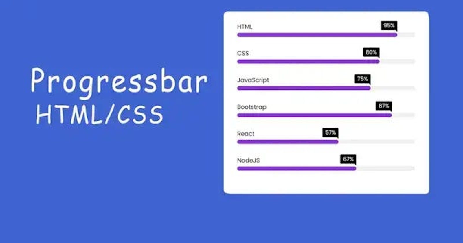
hey there, today we are going to learn How to Make a Progress Bar in HTML and CSS. It’s a very helpful project for your website when you will use it inside your website. Your site looks better than normal.
Progress bars are a valuable tool in web development that visually represents the completion status of a task or process to users. They provide a clear and intuitive way to convey progress and keep users engaged.
While HTML provides a built-in progress element, it may not offer the desired customization options. In this article, we will explore how to create a custom progress bar using HTML and CSS, without delving into the actual code.
By understanding the core concepts and techniques involved, you can easily implement progress bars in your projects and customize them to suit your specific needs.
Understanding the HTML Structure:

<!DOCTYPE html>
<html lang="en">
  <head>
    <meta charset="UTF-8" />
    <meta http-equiv="X-UA-Compatible" content="IE=edge" />
    <meta name="viewport" content="width=device-width, initial-scale=1.0" />
    <title>Progress Bar in HTML and CSS</title>
    <link rel="stylesheet" href="css/style.css" />
  </head>
  <body>
    <div class="skills_bar">
      <div class="bar">
        <div class="info">
          <span>HTML</span>
        </div>
        <div class="progress_line html"><span></span></div>
      </div>
      <div class="bar">
        <div class="info">
          <span>CSS</span>
        </div>
        <div class="progress_line css"><span></span></div>
      </div>
      <div class="bar">
        <div class="info">
          <span>JavaScript</span>
        </div>
        <div class="progress_line js"><span></span></div>
      </div>
      <div class="bar">
        <div class="info">
          <span>Bootstrap</span>
        </div>
        <div class="progress_line bootstrap"><span></span></div>
      </div>
      <div class="bar">
        <div class="info">
          <span>React</span>
        </div>
        <div class="progress_line react"><span></span></div>
      </div>
      <div class="bar">
        <div class="info">
          <span>NodeJS</span>
        </div>
        <div class="progress_line nodejs"><span></span></div>
      </div>
    </div>
    <script src="js/script.js"></script>
  </body>
</html>
To create a progress bar, you need to define the appropriate HTML structure. A progress bar typically consists of a container and an indicator. The container element encapsulates the entire progress bar, while the indicator represents the current progress.
CSS Styling:
@import url("https://fonts.googleapis.com/css2?family=Poppins&display=swap");


* {
  padding: 0;
  margin: 0;
  box-sizing: border-box;
  font-family: "poppins", sans-serif;
}
body {
  display: flex;
  justify-content: center;
  align-items: center;
  min-height: 100vh;
  background: #ddd;
}
.skills_bar {
  width: 600px;
  background: #fff;
  box-shadow: 5px 5px 10px rgba(0, 0, 0, 0.2);
  border-radius: 10px;
  padding: 2rem 2.5rem;
}
.skills_bar .bar {
  margin: 2.2rem 0;
}
.skills_bar .bar:first-child {
  margin-top: 0px;
}
.skills_bar .bar .info {
  margin-bottom: 5px;
}
.skills_bar .bar .info span {
  font-size: 1.1rem;
  font-weight: 500;
}
.skills_bar .bar .progress_line {
  height: 12px;
  width: 100%;
  background: #f0f0f0;
  border-radius: 10px;
  position: relative;
  box-shadow: inset 0px 1px 1px rgba(0, 0, 0, 0.05),
    0px 1px rgba(255, 255, 255, 0.8);
  transform: scaleX(0);
  transform-origin: left;
  animation: animate 1s cubic-bezier(1, 0, 0.5, 1) forwards;
}
@keyframes animate {
  100% {
    transform: scaleX(1);
  }
}
.bar .progress_line span {
  height: 100%;
  width: 80%;
  position: absolute;
  background: #8834db;
  border-radius: 10px;
  transform: scaleX(0);
  transform-origin: left;
  animation: animate 1s 1s cubic-bezier(1, 0, 0.5, 1) forwards;
}
.progress_line.html span {
  width: 90%;
}
.progress_line.css span {
  width: 80%;
}
.progress_line.js span {
  width: 75%;
}
.progress_line.bootstrap span {
  width: 87%;
}
.progress_line.react span {
  width: 57%;
}
.progress_line.nodejs span {
  width: 67%;
}
.bar .progress_line span::before {
  position: absolute;
  content: "";
  height: 0;
  width: 0;
  border: 7px solid transparent;
  border-bottom-width: 0;
  border-right-width: 0;
  border-top-color: #000;
  right: 0;
  top: -10px;
}
.bar .progress_line span::after {
  position: absolute;
  right: 0;
  top: -35px;
  background: #000;
  color: #fff;
  padding: 1px 8px;
  border-radius: 3px;
}
.progress_line.html span::after {
  content: "95%";
}
.progress_line.css span::after {
  content: "80%";
}
.progress_line.js span::after {
  content: "75%";
}
.progress_line.bootstrap span::after {
  content: "87%";
}
.progress_line.react span::after {
  content: "57%";
}
.progress_line.nodejs span::after {
  content: "67%";
}
CSS plays a crucial role in shaping the appearance of the progress bar. By applying CSS styles, you can define the size, color, and other visual aspects of both the container and the indicator.
Progress Tracking and Updating:
To make the progress bar dynamic, you need to track the progress of a task or process and update the indicator accordingly. This can be done through JavaScript or other programming languages. However, for the purpose of this article, we will focus solely on the HTML and CSS aspects.
Customization Options:
One of the advantages of creating a custom progress bar is the ability to tailor it to your specific design requirements. With HTML and CSS, you can customize various aspects of the progress bar, such as its shape, color scheme, animation, and additional visual effects.
Responsive Design Considerations:
In today’s mobile-driven world, it is crucial to ensure that your progress bar is responsive and adaptable to different screen sizes and devices. With CSS media queries and responsive design techniques, you can make your progress bar look great on any device.
Accessibility:
Accessibility is a key consideration when designing any web element, including progress bars. To ensure that your progress bar is accessible to all users, make sure to include appropriate alternative text and provide keyboard navigation options.
Cross-Browser Compatibility:
Different web browsers may interpret CSS styles differently, which can affect the appearance and behavior of your progress bar. It is important to test your progress bar across multiple browsers and versions to ensure consistent rendering.
Enhancements and Advanced Techniques:
Once you have mastered the basics, you can explore advanced techniques to enhance your progress bar further. This may include using CSS animations, transitions, and JavaScript interactions to create more engaging and interactive progress bars.
You May Also Like:
How to Make Progress Bar in HTML and CSS
I’ve made the complete video tutorial on it, If you face any problem inside the codes, you can watch the tutorial. Once you watch it completely, then hope you’ve learned everything that you need.
Conclusion:
Creating a progress bar using HTML and CSS allows you to design a visually appealing and customized element that effectively communicates progress to your users. By understanding the HTML structure, applying CSS styles, tracking progress, and considering factors like responsiveness, accessibility, and cross-browser compatibility, you can create a seamless user experience.
Experiment with various customization options and explore advanced techniques to take your progress bars to the next level. With the knowledge gained from this article, you are well-equipped to implement progress bars in your web projects and elevate the overall user experience.
