

Hey everyone, I hope you are fine, today we will create a Responsive Personal Portfolio Website only using HTML and CSS from scratch. I’ve been creating different types of projects using HTML CSS and JavaScript. But, it’s a pure HTML and CSS-based project, It’s a fully responsive and simple project.
Everyone will able to see clean and understandable codes that I used inside the project. So, you can learn step by step how to make a completely responsive personal portfolio website.
In the digital age, having a personal portfolio website is a great way to showcase your skills, projects, and achievements to the world. Fortunately, you don’t need to be a coding expert to create an impressive portfolio. In this article, we’ll explore how to build a responsive personal portfolio website using only HTML and CSS — two fundamental web development languages that are easy for beginners to grasp.
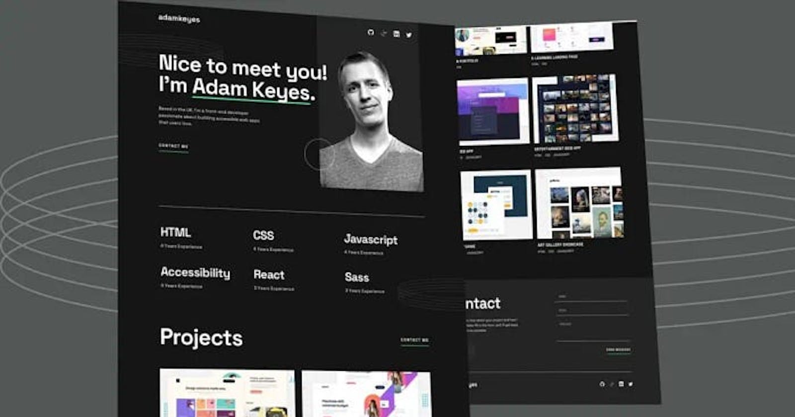
Personal Portfolio Website only using HTML and CSS
However, I made the complete video tutorial you can watch it till to end, after that I hope you’ve a lot of knowledge to create any type of website from scratch. I’m going to share with you the source code of the project below.
Hope you’ve watched till to end of the video and you’ve learned something new from this tutorial. I hope this is helpful for you. Let’s look at the source code.
You May Also Like:
HTML (Hypertext Markup Language) is the backbone of any web page, providing the structure and content. CSS (Cascading Style Sheets) complements HTML by adding style and design, making your website visually appealing. Together, these two languages form the foundation for creating a sleek and professional personal portfolio.
Structuring Your Portfolio with HTML
Begin by organizing the content of your portfolio using HTML. Think of HTML as a series of containers that hold different elements like headings, paragraphs, images, and links. Create sections for your introduction, skills, projects, and contact information. This step sets the groundwork for the visual presentation of your portfolio.
<!--===============Navbar==================== -->
    <div class="container">
      <nav>
        <div class="logo">
          <h2>adamkeys</h2>
        </div>
        <div class="social_icons">
          <img src="images/icon-github.svg" alt="" />
          <img src="images/icon-linkedin.svg" alt="" />
          <img src="images/icon-twitter.svg" alt="" />
        </div>
      </nav>
    </div>
Styling Your Portfolio with CSS
Once your HTML structure is in place, it’s time to add style with CSS. You can define colors, fonts, spacing, and other visual elements to make your portfolio visually appealing. CSS allows you to create a cohesive and professional look that reflects your personality and style. Remember, a well-designed portfolio can leave a lasting impression on visitors.
@font-face {
  font-family: "Space-Grotesk";
  src: url("/fonts/SpaceGrotesk-VariableFont_wght.ttf");
}

:root {
  --black: #151515;
  --green: #4ee1a0;
  --dark: #242424;
  --grey: #d9d9d9;
  --white: #ffffff;
}
* {
  padding: 0;
  margin: 0;
  box-sizing: border-box;
}
body {
  font-family: "Space-Grotesk";
  background-color: var(--black);
  overflow-x: hidden;
}
.container {
  max-width: 1440px;
  width: 100%;
  margin: 0 auto;
  padding: 0 2rem;
}
/* ================Utality Classes=============== */
.contact span {
  text-transform: uppercase;
  color: var(--white);
  cursor: pointer;
  position: relative;
}
.contact span::before {
  position: absolute;
  content: "";
  width: 100%;
  background-color: var(--green);
  height: 2px;
  bottom: -10px;
}
.contact span:hover {
  color: var(--green);
}
.heading {
  font-size: 3rem;
  color: var(--white);
}
/*===============navbar================= */
nav {
  display: flex;
  align-items: center;
  justify-content: space-between;
  color: var(--white);
  padding: 2rem 0;
  z-index: 10;
}

nav .logo {
  font-size: 1.2rem;
}
nav .social_icons img {
  width: 25%;
  padding-left: 15px;
}
Once you’ve used the above codes you will able to see your navbar is ready now, let’s look at the codes that were used to make a showcase. let’s look at the HTML codes that help us to make a showcase on our website.
<!--===============showcase==================== -->
    <div class="container">
      <header>
        <div class="left">
          <div class="img_ring">
            <img src="/images/pattern-rings.svg" alt="" />
          </div>
          <h2>Nice to meet you</h2>
          <h2 class="name">I'm <span>Adam Keyes</span></h2>
          <p class="about">
            Based in the UK, I'm a front-end developer passionate about building
            accessible web apps that users love.
          </p>
          <p class="contact"><span>Contact Me</span></p>
        </div>
        <div class="right">
          <div class="profile_img">
            <img src="./images/image-profile-desktop.webp" alt="" />
          </div>
          <img src="images/pattern-circle.svg" alt="" />
        </div>
      </header>
    </div>
Let’s see the CSS codes that are used to design the showcase section on our website.
/*===============showcase================= */
header {
  width: 100%;
  height: 60vh;
  display: flex;
  justify-content: space-between;
  align-items: center;
  position: relative;
}

header .left h2 {
  font-size: 5rem;
  letter-spacing: 5px;
  color: var(--white);
}
header .left .name span {
  position: relative;
}
header .left .name span::before {
  position: absolute;
  width: 100%;
  content: "";
  background-color: var(--green);
  height: 5px;
  bottom: 0;
}
header .left .about {
  color: var(--grey);
  width: 50%;
  margin: 2rem 0;
  line-height: 1.7;
  font-size: 1.2rem;
}
header .right {
  width: 30%;
  z-index: -1;
  position: relative;
}
header .right .profile_img img {
  width: 100%;
  height: auto;
  object-fit: cover;
  transform: translateY(-12%);
}
.img_ring {
  position: absolute;
}
.img_ring img {
  width: 100%;
  object-fit: cover;
  transform: translate(-50%, -40%);
}
header .right > img {
  position: absolute;
  object-fit: cover;
  top: 70%;
  transform: translate(-50%, -50%);
}
header::before {
  position: absolute;
  content: "";
  background-color: var(--dark);
  height: 3px;
  width: 100%;
  bottom: -5%;
}
You’ve successfully made the navbar and showcase sections, let’s see how to add another section inside the website. Let’s add the skills sections here in HTML codes.
<!--===============skills==================== -->
    <div class="container">
      <div class="skills">
        <div class="sk_content">
          <div class="html">
            <h2>HTML</h2>
            <p>4 years Experience</p>
          </div>
          <div class="css">
            <h2>CSS</h2>
            <p>4 years Experience</p>
          </div>
          <div class="JS">
            <h2>JavaScript</h2>
            <p>4 years Experience</p>
          </div>
          <div class="access">
            <h2>Accessiblity</h2>
            <p>4 years Experience</p>
          </div>
          <div class="html">
            <h2>React</h2>
            <p>3 years Experience</p>
          </div>
          <div class="html">
            <h2>Sass</h2>
            <p>3 years Experience</p>
          </div>
        </div>
        <div class="ring_skills">
          <img src="/images/pattern-rings.svg" alt="" />
        </div>
      </div>
    </div>
great let’s see the codes that were used to design the skill section.
/*===============Skills================= */
.skills {
  color: var(--white);
  width: 110%;
  position: relative;
}

.skills .sk_content {
  display: grid;
  grid-template-columns: repeat(3, 1fr);
  grid-gap: 4rem;
  margin: 6rem 0;
}
.skills h2 {
  font-size: 2.5rem;
}
.ring_skills {
  position: absolute;
  right: -25%;
  top: 70%;
}
Let’s move another sections that called projects, inside that have many images and however effect. When you will hover the mouse on the particular project. You can see the links that appear inside the image, so let’s look at the HTML codes.
<!--===============Projects==================== -->
    <div class="container">
      <div class="proj_content">
        <div class="headings">
          <h2 class="heading">Project</h2>
          <p class="contact"><span>Contact Me</span></p>
        </div>

<div class="pro_imgs">
          <div class="img_content">
            <div class="pro">
              <img src="images/thumbnail-project-1-large.webp" alt="" />
              <div class="overlay">
                <div class="over_content">
                  <p><a href="#">View Project</a></p>
                  <p><a href="#">View Code</a></p>
                </div>
              </div>
              <h3>Design Portfolio</h3>
              <p>HTML CSS</p>
            </div>
            <div class="pro">
              <div class="overlay">
                <div class="over_content">
                  <p><a href="#">View Project</a></p>
                  <p><a href="#">View Code</a></p>
                </div>
              </div>
              <img src="images/thumbnail-project-2-large.webp" alt="" />
              <h3>E-Learning page</h3>
              <p>HTML CSS</p>
            </div>
            <div class="pro">
              <div class="overlay">
                <div class="over_content">
                  <p><a href="#">View Project</a></p>
                  <p><a href="#">View Code</a></p>
                </div>
              </div>
              <img src="images/thumbnail-project-3-large.webp" alt="" />
              <h3>Todo Web App</h3>
              <p>HTML CSS JavaScript</p>
            </div>
            <div class="pro">
              <div class="overlay">
                <div class="over_content">
                  <p><a href="#">View Project</a></p>
                  <p><a href="#">View Code</a></p>
                </div>
              </div>
              <img src="images/thumbnail-project-4-large.webp" alt="" />
              <h3>Entertainment Web App</h3>
              <p>HTML CSS JavaScript</p>
            </div>
            <div class="pro">
              <div class="overlay">
                <div class="over_content">
                  <p><a href="#">View Project</a></p>
                  <p><a href="#">View Code</a></p>
                </div>
              </div>
              <img src="images/thumbnail-project-5-large.webp" alt="" />
              <h3>Memory Game</h3>
              <p>HTML CSS JavaScript</p>
            </div>
            <div class="pro">
              <div class="overlay">
                <div class="over_content">
                  <p><a href="#">View Project</a></p>
                  <p><a href="#">View Code</a></p>
                </div>
              </div>
              <img src="images/thumbnail-project-6-large.webp" alt="" />
              <h3>Art Gallery</h3>
              <p>HTML CSS JavaScript</p>
            </div>
          </div>
        </div>
      </div>
    </div>
It’s the second last section, So, let’s see the CSS codes that design the project section.
/*===============Project================= */
.proj_content {
  margin: 3rem 0;
}

.headings {
  display: flex;
  justify-content: space-between;
}
.pro_imgs {
  margin: 2rem 0;
}
.img_content {
  display: grid;
  grid-template-columns: repeat(2, 1fr);
  grid-gap: 2rem;
  color: var(--white);
  text-transform: uppercase;
}
.img_content p {
  color: var(--grey);
}
.img_content img {
  width: 100%;
  object-fit: cover;
  margin-bottom: 1rem;
}
.pro {
  position: relative;
  cursor: pointer;
}
.pro .overlay {
  position: absolute;
  top: 0;
  left: 0;
  width: 100%;
  height: 88.5%;
  background-color: rgba(0, 0, 0, 0.5);
  display: none;
}
.over_content {
  position: absolute;
  top: 50%;
  left: 50%;
  transform: translate(-50%, -50%);
  text-align: center;
}
.over_content p {
  text-align: center;
  margin: 2rem 0;
}
.over_content p a {
  color: var(--white);
  text-decoration: none;
  border-bottom: 2px solid var(--green);
}
.pro:hover .overlay {
  display: block;
}
Guys You’ve completed four sections of the personal portfolio website. let’s see the final footer sections HTML and CSS codes that use to make a footer section inside the website.

<!--===============Contact==================== -->
    <footer>
      <div class="container">
        <div class="contact_section">
          <div class="contact_fields">
            <div class="contact_details">
              <h2 class="heading">Contact</h2>
              <p>
                I would love to hear about your project and how I could help.
                Please fill in the form, and I’ll get back to you as soon as
                possible
              </p>
            </div>
            <div class="form_fields">
              <form action="#">
                <input type="text" placeholder="NAME" />
                <input type="text" placeholder="EMAIL" />
                <textarea
                  name=""
                  id=""
                  cols="10"
                  rows="5"
                  placeholder="MESSAGE"
                ></textarea>
                <button type="button">SEND MESSAGE</button>
              </form>
            </div>
          </div>
        </div>
      </div>
      <div class="copyright_content">
        <div class="container">
          <nav>
            <div class="logo">
              <h2>adamkeys</h2>
            </div>
            <div class="social_icons">
              <img src="images/icon-github.svg" alt="" />
              <img src="images/icon-linkedin.svg" alt="" />
              <img src="images/icon-twitter.svg" alt="" />
            </div>
          </nav>
        </div>
      </div>
    </footer>
  </body>
</html>
Here is last section of the website footer CSS codes is
/*===============Contact================= */
footer {
  background-color: var(--dark);
}

.contact_section {
  padding: 4rem 0;
}
.contact_fields {
  display: grid;
  grid-template-columns: repeat(2, 1fr);
  grid-gap: 3rem;
}
.contact_details {
  color: var(--grey);
  text-align: justify;
  width: 70%;
}
.contact_details p {
  margin: 1rem 0;
  font-size: 1.1rem;
  line-height: 1.5;
}
.form_fields form input,
textarea {
  width: 100%;
  outline: none;
  border: none;
  font-family: inherit;
  background: transparent;
  border-bottom: 1px solid var(--grey);
  padding: 0.5rem 1rem;
  margin-bottom: 1rem;
  color: var(--white);
  font-size: 1rem;
  resize: none;
}
.form_fields button {
  display: block;
  margin-left: auto;
  border: none;
  outline: none;
  background-color: transparent;
  color: var(--grey);
  cursor: pointer;
}
.form_fields button:hover {
  border-bottom: 1px solid var(--green);
  color: var(--green);
}
.copyright_content nav {
  border-top: 1px solid var(--grey);
}
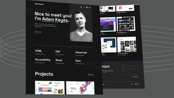
Congratulations, you’ve successfully designed the complete personal portfolio website only using HTML and CSS from scratch, but it’s desktop-based, you can use media query to make it responsive. Let’s see the usage of media queries to make a responsive website.
@media (max-width: 1024px) {
  .container {
    padding: 0 1.5rem;
  }
  .heading {
    font-size: 2.5rem;
  }

header .left h2 {
    font-size: 4rem;
    letter-spacing: 4px;
  }
  header .right {
    width: 55%;
    z-index: -1;
  }
  header .left .about {
    width: 70%;
  }
  .skills {
    width: 100%;
    position: relative;
    overflow: hidden;
  }
  .ring_skills {
    position: absolute;
    right: -40%;
    top: 70%;
  }
  .pro .overlay {
    height: 85%;
  }
  .over_content {
    position: absolute;
    top: 50%;
    left: 50%;
    transform: translate(-50%, -50%);
    text-align: center;
  }
}


@media (max-width: 768px) {
  .container {
    padding: 0 1rem;
  }
  .heading {
    font-size: 2rem;
  }
  nav {
    width: 100%;
    row-gap: 1rem;
  }
  header {
    height: 40vh;
  }
  header .left h2 {
    font-size: 3rem;
    letter-spacing: 3px;
  }
  header .left .about {
    font-size: 1rem;
  }
  header .right {
    width: 65%;
  }
  header .right {
    overflow-x: hidden;
  }
  header .right > img {
    width: 50%;
    transform: translate(150%, -80%);
  }
  header .right .profile_img img {
    content: url("/images/image-profile-tablet.webp");
    transform: translateY(-15%);
    height: auto;
    object-fit: cover;
  }
  .skills .sk_content {
    grid-template-columns: repeat(2, 1fr);
  }
  .pro .overlay {
    height: 80.5%;
  }
  .contact_section {
    width: 100%;
  }
  .contact_fields {
    display: flex;
    flex-direction: column;
    justify-content: center;
    align-items: center;
  }
}

@media ((max-width: 767px) and (min-width: 320px)) {
  nav {
    flex-direction: column;
  }
  header {
    flex-direction: column;
    height: 100vh;
  }
  header .left h2 {
    font-size: 2rem;
    text-align: center;
  }
  header .left .about {
    font-size: 1rem;
    width: 100%;
    text-align: center;
  }
  header .right > img {
    width: 50%;
    transform: translate(100%, -50%);
  }
  header .right .profile_img img {
    content: url("/images/image-profile-mobile.webp");
    width: 100%;
    height: fit-content;
    object-fit: cover;
  }
  .contact {
    text-align: center;
  }
  .skills {
    width: 100%;
    text-align: center;
  }
  .skills .sk_content {
    grid-template-columns: 1fr;
  }
  .ring_skills {
    right: -50%;
    top: 70%;
  }
  .pro .overlay {
    height: 88.5%;
  }
  .img_content {
    grid-template-columns: 1fr;
  }
}
@media (max-width: 375px) {
  header {
    height: 85vh;
  }
  header .right {
    overflow: hidden;
  }
}
In the modern era, your portfolio must look good on all devices — from desktops to smartphones. Responsive design ensures that your website adapts to different screen sizes, providing an optimal viewing experience for every visitor. Utilize CSS media queries to adjust your layout, fonts, and images based on the device’s screen size.
Tips for an Effective Portfolio:
Keep it Simple: A clutter-free design is more effective in conveying your message. Focus on essential information and projects.
Showcase Your Work: Feature your best projects prominently. Include images, descriptions, and links to demonstrate your skills and accomplishments.
Highlight Your Skills: Create a section dedicated to showcasing your skills and expertise. Use clear headings and concise descriptions to make it easy for visitors to understand your strengths.
Contact Information: Ensure that your contact information is easily accessible. Include links to your social media profiles or a contact form for potential opportunities.
Test Across Devices: Before publishing, test your portfolio on different devices to ensure a seamless and consistent experience for all users.
How to Upload HTML Website on Server
Let’s see how to upload your website on cpanel or you can say online server. I made the tutorial inside the tutorial you will learn step-by-step how to upload your HTML-based or static website on the server. Once you do that your site will appear online, and then you can access it anywhere you want.
Conclusion:
Building a responsive personal portfolio website using HTML and CSS is a rewarding and accessible endeavor. By following these steps and incorporating the provided tips, you can create a visually appealing and functional portfolio that effectively showcases your talents to the world. Remember, your portfolio is a reflection of your skills and personality, so make it stand out with a thoughtful design.